
Technacy
Brand Guidelines
Studio
How the logo is built and used
The new Technacy logo is a geometric redesign of the original logo, paired with a tagline set in Px Grotesk.


Colour
Using colour with purpose improves communication and strengthens the brand identity
The right colours make content clearer and easier to read.
They also convey the brand personality and keep it visually consistent.
Fonts
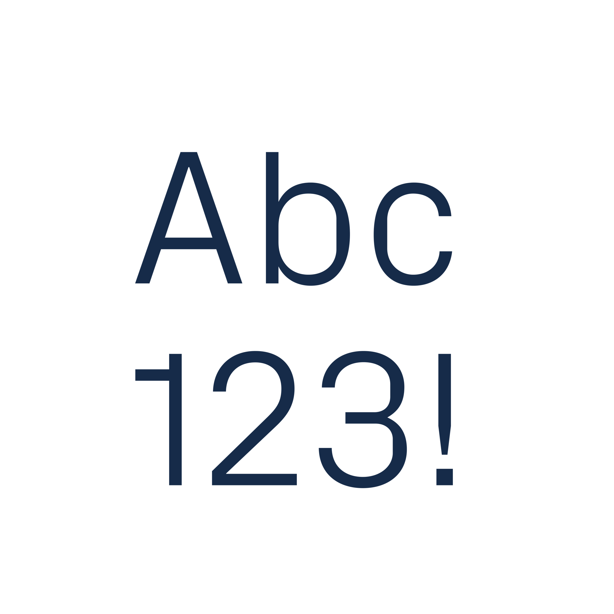
Giving our content character
Typography makes content readable, sets a clear hierarchy, highlights key information and expresses the brand at its best.

Tone of voice
Our language reflects our commitment and the relationships we build in the world
Our voice defines how we relate to others, offering experiences, resources, information and interactions that are always effective and valuable.
If you can't find what you're looking for or need other resources, contact us.